The Challenge
We partnered with LBH v.a. to build a brand identity that captures their warmth and efficiency. The name itself speaks volumes-small in size, big on help-and we translated that into a brand that’s friendly, professional, and full of heart.
Here’s how we solved it
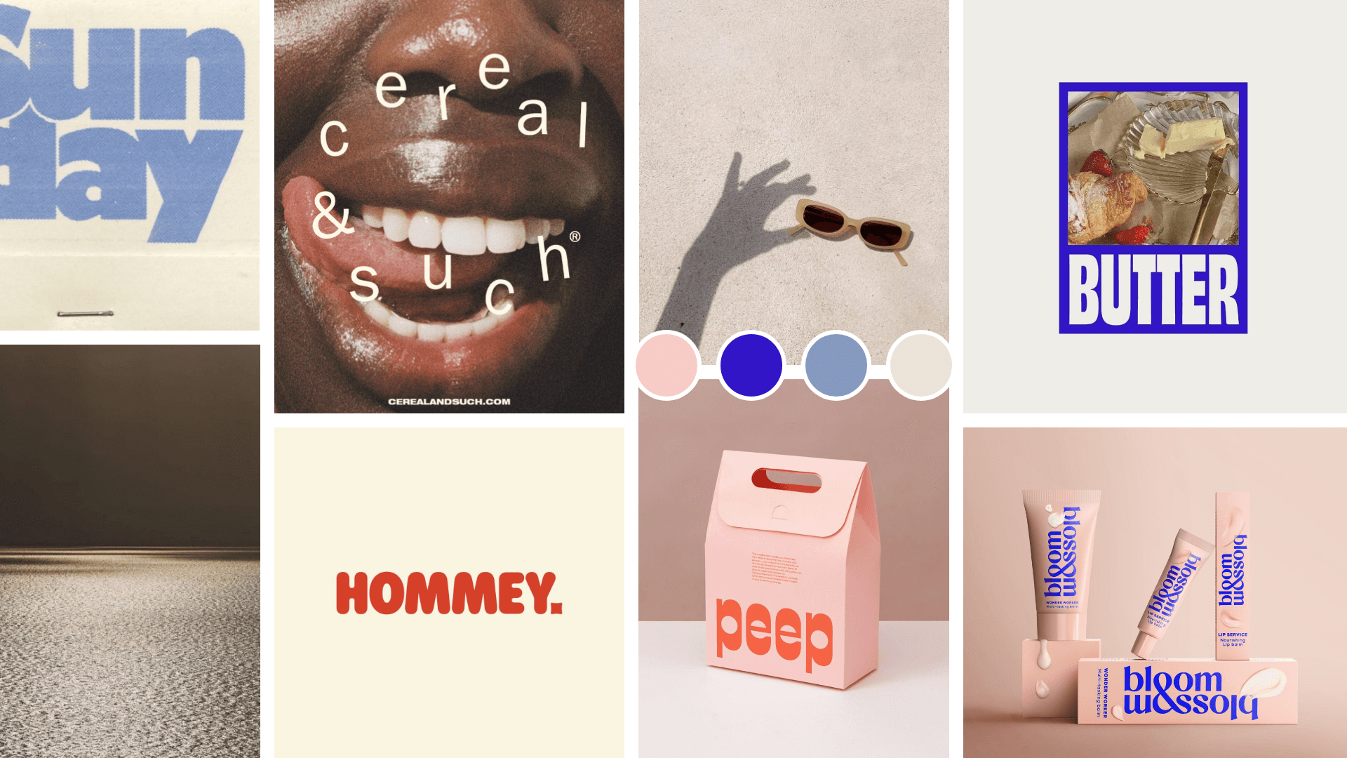
We developed; a bold yet approachable visual identity, a colour palette that balances playful energy with classic professionalism and a tone of voice that’s human, helpful, and quietly confident. The result is a brand that reflects LBH VA’s unique personality and unwavering commitment to their clients’ peace of mind.
With these services we made it happen

Strategy - the big idea phase

Identity - the personality creation

First, we crafted the signature branding elements
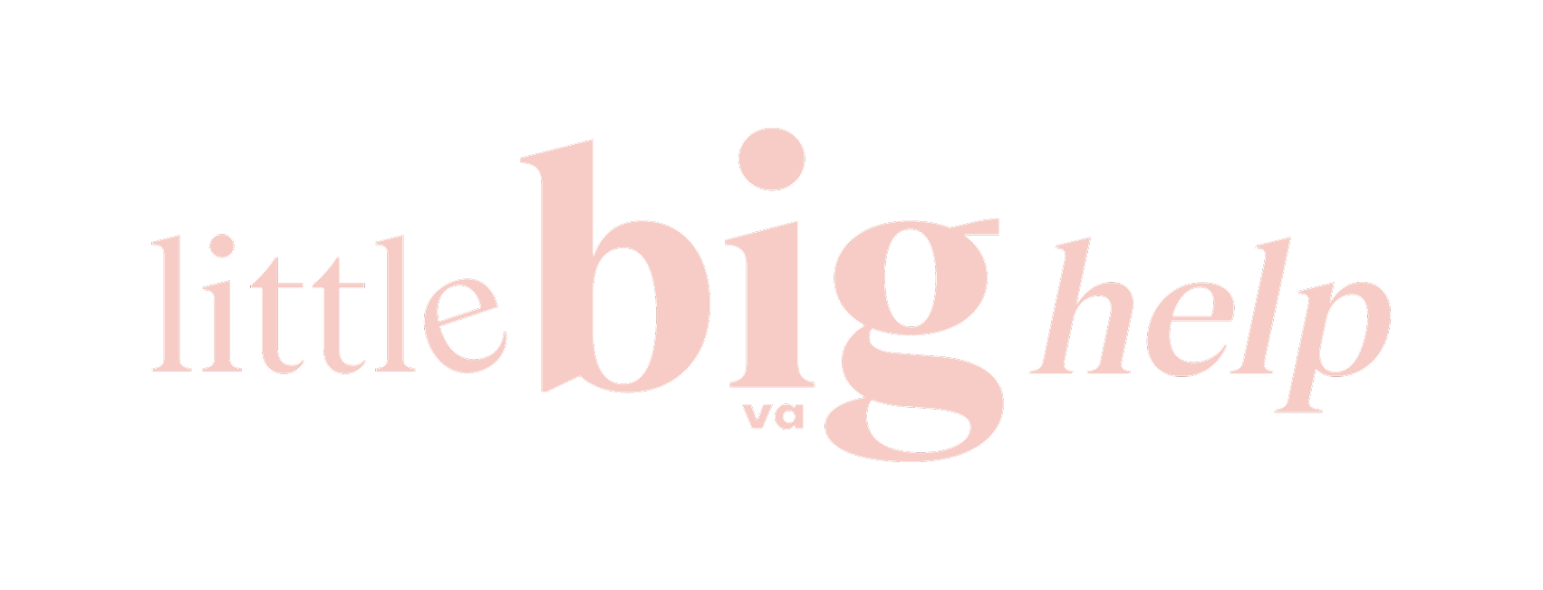
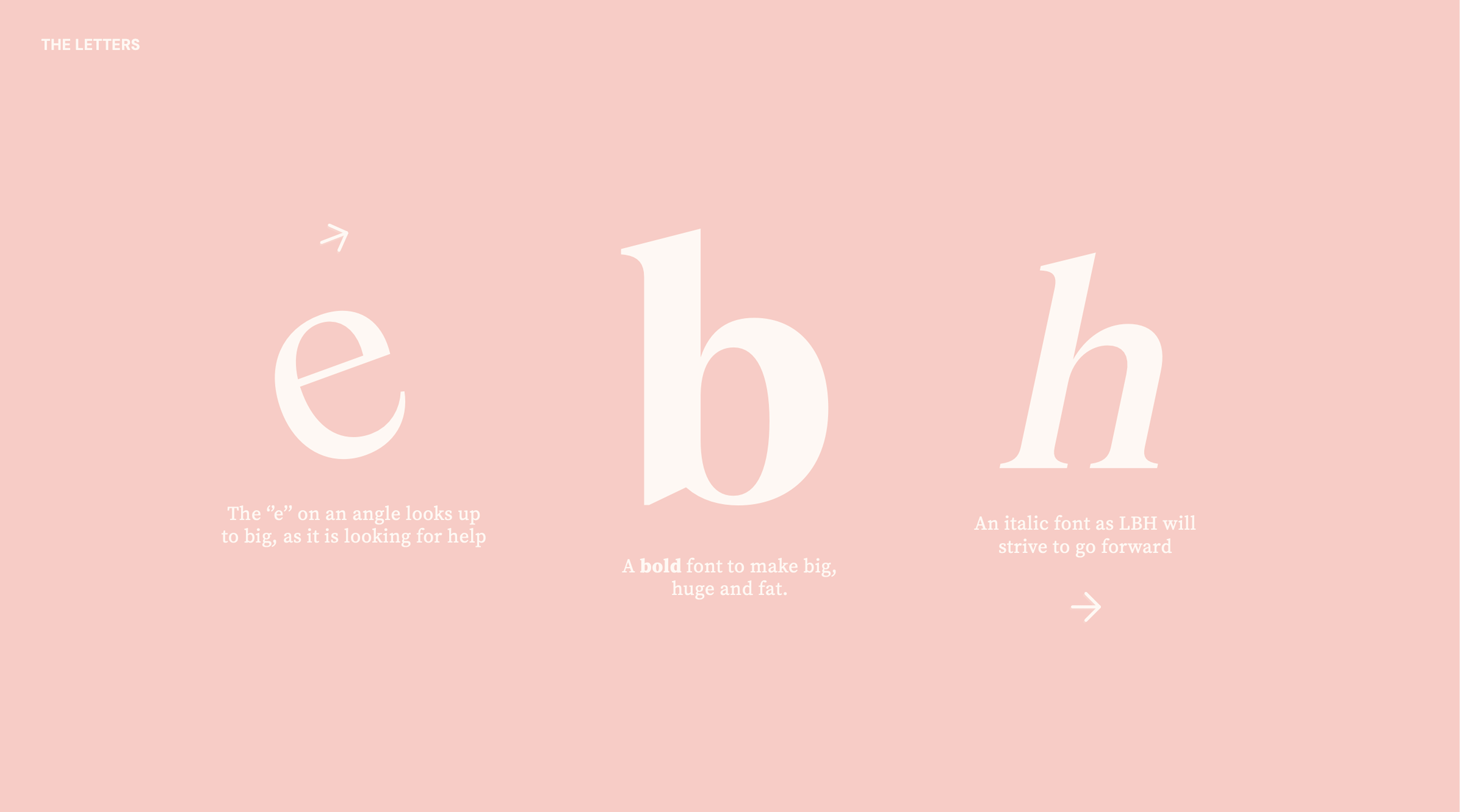
The logo was designed to visually reflect the essence of Little Big Help VA. The tilted ‘e’ subtly looks upward-symbolising the search for support and connection to something bigger. The bold, oversized typeface for “Big” brings a sense of strength and impact, while the use of italics throughout the logo captures the brand’s forward motion and drive to keep moving, helping, and growing.
logo

brandbook
Next, we brought the brand with visual elements
The logo was designed to visually reflect the essence of Little Big Help VA. The tilted ‘e’ subtly looks upward-symbolising the search for support and connection to something bigger. The bold, oversized typeface for “Big” brings a sense of strength and impact, while the use of italics throughout the logo captures the brand’s forward motion and drive to keep moving, helping, and growing.
