The Challenge
How do we solve the challenge of Colour Analysis Studio’s visual identity no longer reflecting its growth and evolution as a recognised name offering both online and in-person services?
Here’s how we solved it
From scattered to seamless. As Colour Analysis Studio grew into a go-to destination for discovering personal colour palettes, both online and in person, its branding no longer reflected the studio’s evolution. Missing the mark on the confidence and sophistication the brand had come to represent.
So we gave the brand a complete refresh, creating a cohesive, elevated look that aligns with its growth and reputation. From a refined colour palette to a polished digital experience, every element was designed to reflect the studio’s mission-empowering people to embrace colour with confidence. Now, the brand doesn’t just speak to its expertise; it feels just as transformative as the service it offers.
With these services we made it happen

Strategy - the big idea phase

Identity - the personality creation

Experience - the brand amplified

First, we crafted the signature branding elements
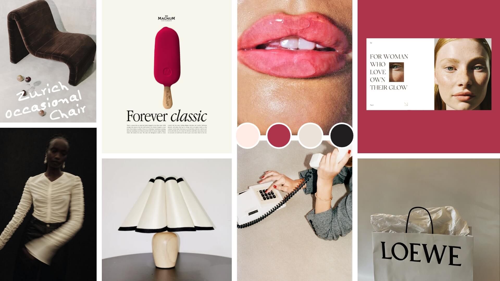
To elevate Colour Analysis Studio's brand, we crafted sophisticated brand elements that captured both the essence of the business and its growth. This included a refined colour palette that reflects the transformative nature of their services, sleek typography to convey professionalism, and a modern visual language that speaks to the studio’s welcoming yet elevated approach.
logo
We created a visual style that paired colours with images in a way that felt effortless, making each colour pop and come to life alongside the imagery.

brandbook
Next, we brought the brand to life digitally
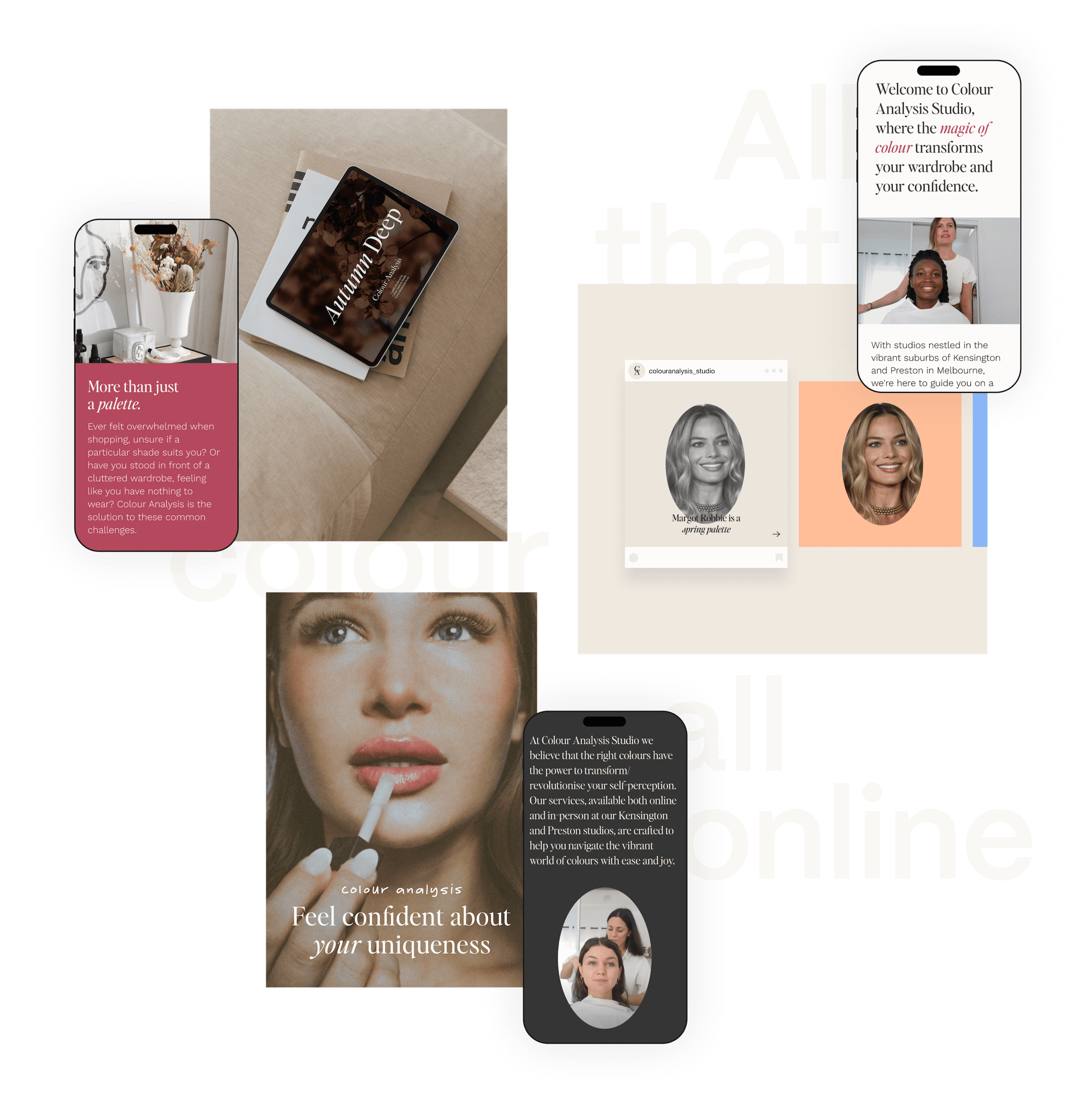
Bold, refined, and effortlessly intuitive, the new Colour Analysis Studio website turns browsing into booking. A polished digital experience that captures the brand’s evolution and empowers every visitor to step into the world of colour with confidence.
online presence
Online Tester
We created an online colour tester that lets visitors instantly see how different colours impact and enhance human natural features.


Project Credits
Website Development
Copy & Tone of Voice
Photography
client love
design is so
impactful
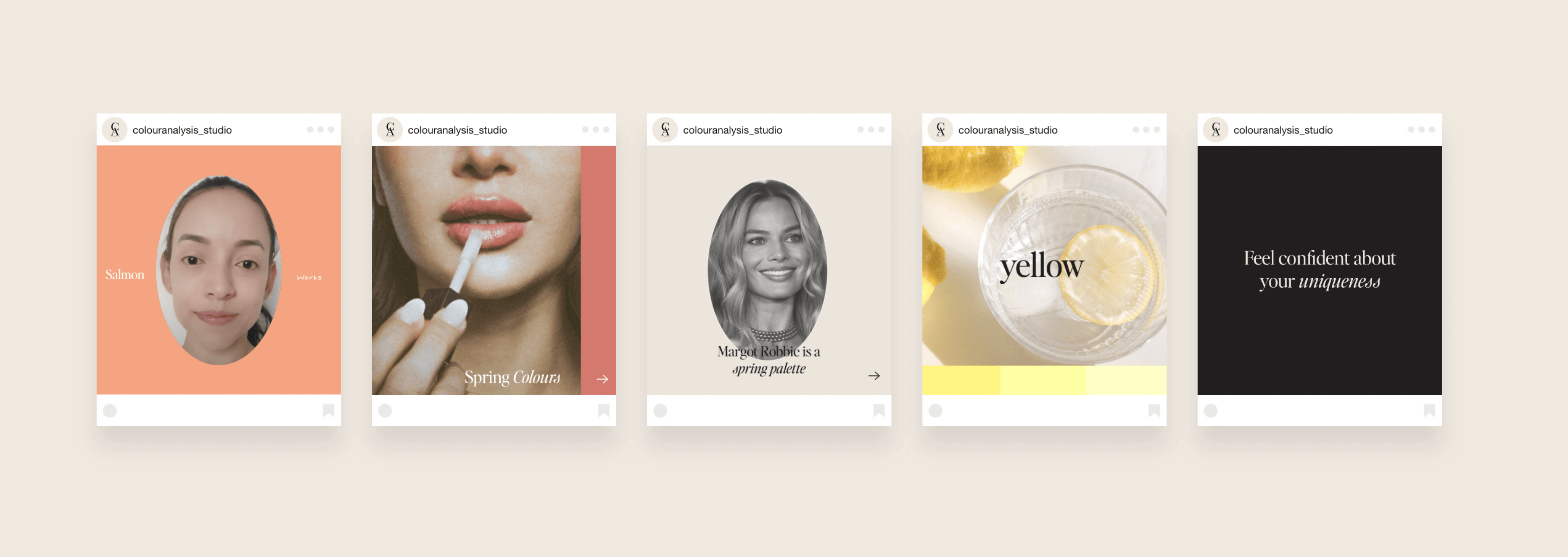
Since launching our new website, we’ve seen a significant increase in engagement and bookings. The design is intuitive and visually striking, with clients loving how easy it is to navigate. Our refreshed branding has also boosted our social media presence, making our visuals more consistent, polished, and professional. It’s helped us connect with followers and, most importantly, truly reflects who we are, elevating both our presentation and how clients perceive us.
Giulia and Alessandra Founders of CAS